
The Crambar
Positioning a New Menu to Achieve Increased Customer Footfall
The promo designs for The Crambar’s new menu launch use a striking visual strategy to grab attention and entice potential diners. Both creatives leverage a top-down presentation of vibrant, beautifully plated dishes, ensuring the focus remains on the visual appeal and diversity of the menu. This overhead angle creates a communal, inviting feel—mimicking the shared experience of dining around a table and immediately communicating abundance and variety.
To differentiate the two designs and maximize their usage across touchpoints, the first creative employs a warm, rustic wooden background, enhancing the authenticity and comfort associated with the restaurant experience. Contrastingly, the second design utilizes a bold red backdrop adorned with soft, thematic illustrations and outlines, infusing a festive, energetic vibe that helps the food imagery pop and draws quick attention in digital or print feeds.
Typography is clean and assertive, with “New Menu! Now Available” clearly prioritized to make the message unmissable. The Crambar’s logo is consistently placed and easily identifiable, reinforcing brand recall. Details like drinks, utensils, and garnishes around the plates add touches of realism and sophistication, completing the narrative of a thoughtful, premium dining event.
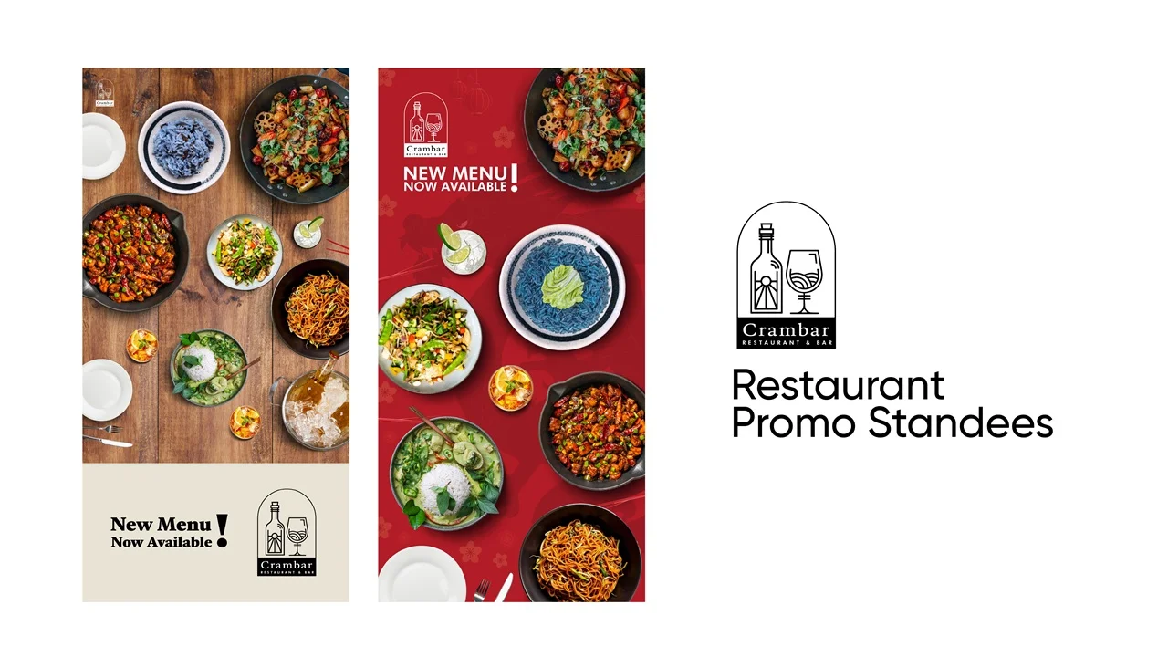
By balancing appetizing food photography, distinctive backdrops, and impactful layout, these designs not only highlight the unique offerings of the new menu but ensure Crambar stands out in a crowded restaurant marketplace—making the launch announcement both memorable and visually compelling.