Rivid
Building a Brand Identity That Attracted Major B2B Contracts
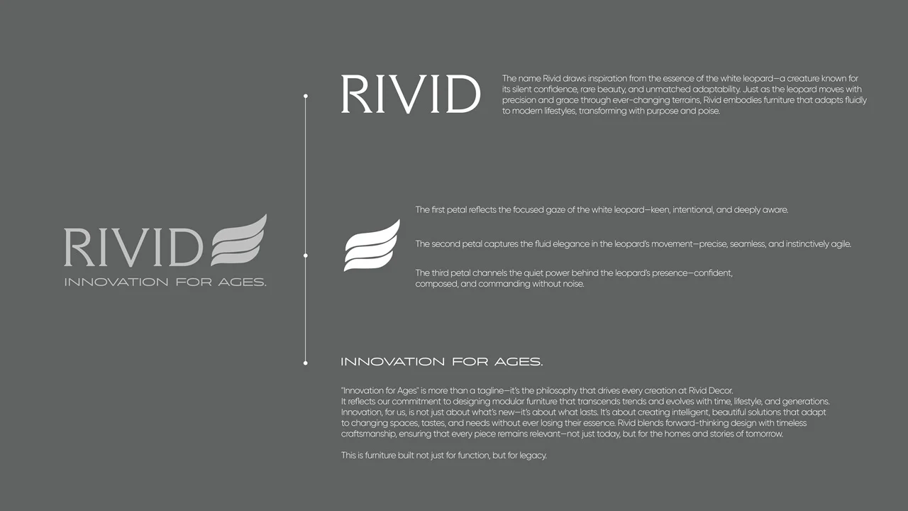
The brand identity and communication design for Rivid Decor are meticulously crafted to convey innovation, adaptability, and timelessness, drawing inspiration from the elegance and silent confidence of the white leopard. The entire visual and verbal language of the brand is anchored in the philosophy “Innovation for Ages,” positioning Rivid not merely as a furniture maker, but as a curator of enduring value and style.
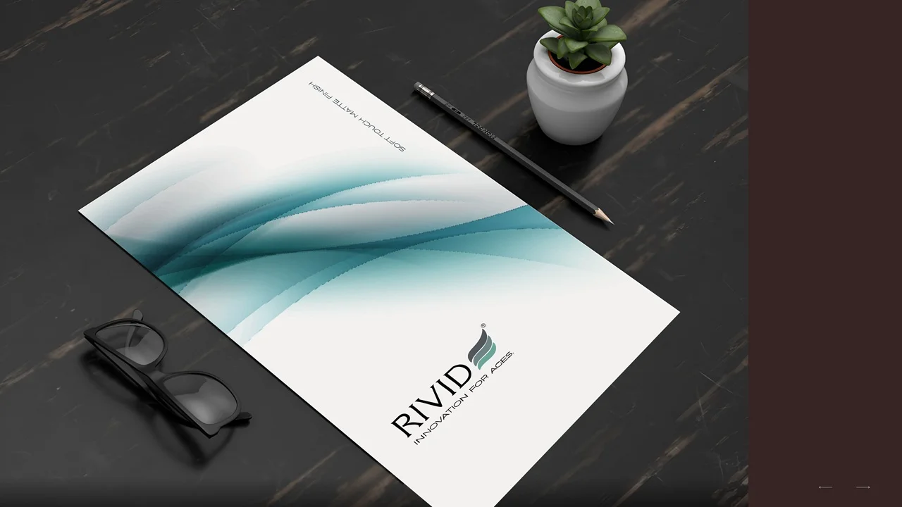
Brand Essence & Symbolism: Rivid’s logo is a sophisticated wordmark paired with a dynamic emblem that alludes to the white leopard’s focused gaze, seamless movement, and quiet power. This visual metaphor embodies the brand values of awareness, agility, and commanding presence. The supportive tagline, “Innovation for Ages,” underscores the brand’s commitment to creating modular furniture that is as adaptable as it is elegant, intended for both current and future generations.
Brand Narrative & Tone: Copy across touchpoints goes beyond conventional product descriptions, weaving a narrative of legacy, lasting craftsmanship, and forward-thinking design. Messaging emphasizes Rivid’s dedication to intelligent solutions that transcend trends, aiming for relevance, functionality, and beauty—making every piece an intelligent investment for evolving lifestyles.
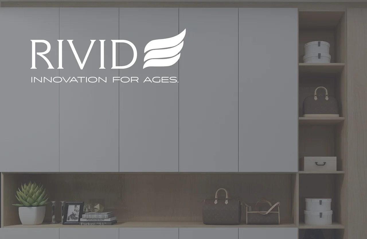
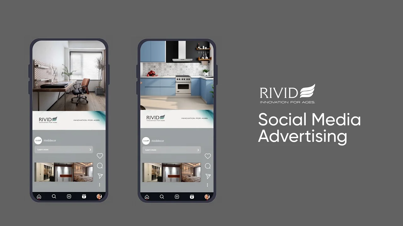
Visual Language & Social Media: Social media advertising uses clean, spacious layouts and natural, modern interiors to highlight the versatility and beauty of Rivid’s offerings. The consistent application of brand elements—logo, emblem, and muted, sophisticated color palettes—creates an instantly recognizable and premium visual identity. Product photography showcases both the tactile quality and refined finish of the materials, elevating the perception of quality.
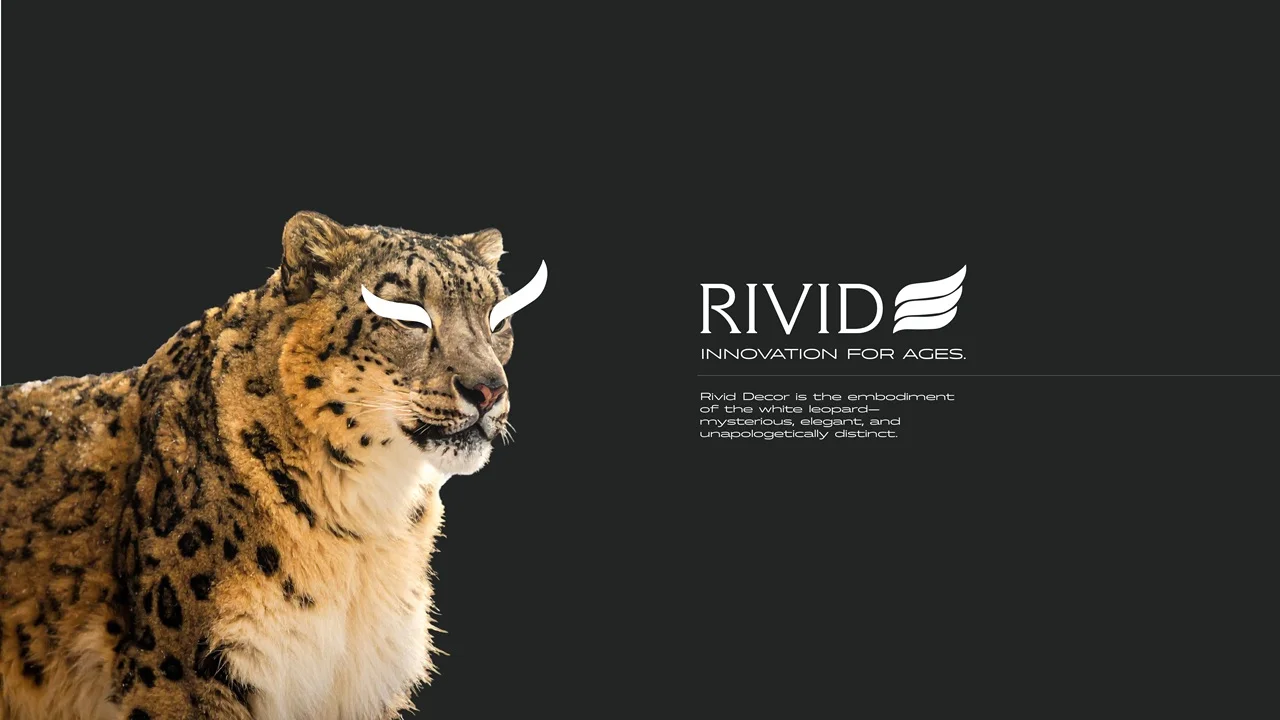
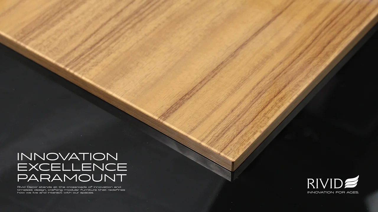
Hero Imagery & Emotional Impact: Key visuals, such as the striking image of a white leopard, reinforce the brand’s foundational symbolism—mysterious, elegant, and distinct. Detailed product close-ups paired with assertive headlines like “INNOVATION EXCELLENCE PARAMOUNT” solidify the brand’s position at the intersection of high design and enduring functionality.