
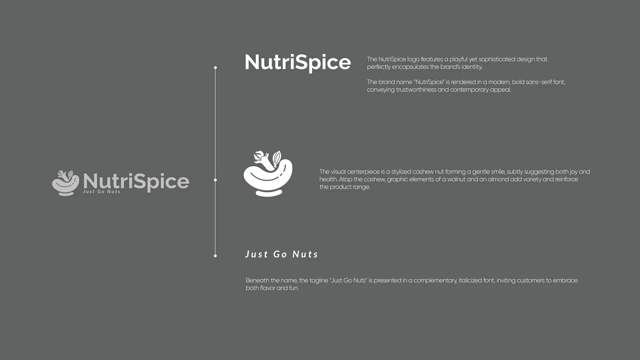
NutriSpice
Driving Sales Through Strategic Packaging for Impactful Storytelling & Shelf Appeal
The brand development and packaging design for NutriSpice is rooted in a modern, approachable, and trustworthy identity tailored for the health food segment. The strategy seamlessly combines playful sophistication with sensorial appeal, ensuring NutriSpice is both memorable and market-ready.
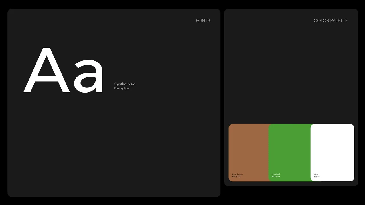
Brand Identity & Typography: The foundation is set with the use of Cyntho Next, a bold sans-serif typeface. This conveys clarity, confidence, and contemporary appeal—essential qualities for a food brand focused on health and authenticity. The color palette, blending an earthy brown (“Dusty Sunrise”), fresh green (“Lime Leaf”), and crisp white, is carefully chosen to evoke naturalness, vitality, and simplicity, reinforcing wholesome and pure brand values.
Logo & Visual System: The logo features a stylized cashew forming a gentle smile, subtly suggesting happiness and well-being. Graphic accompaniment—walnut and almond icons—reinforces NutriSpice’s diverse range while adding a note of variety and fun. The tagline, “Just Go Nuts,” is rendered in a complementary italicized font to emphasize both flavor and a playful spirit.
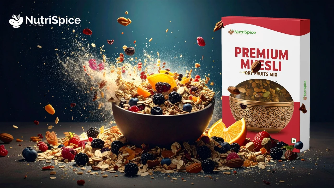
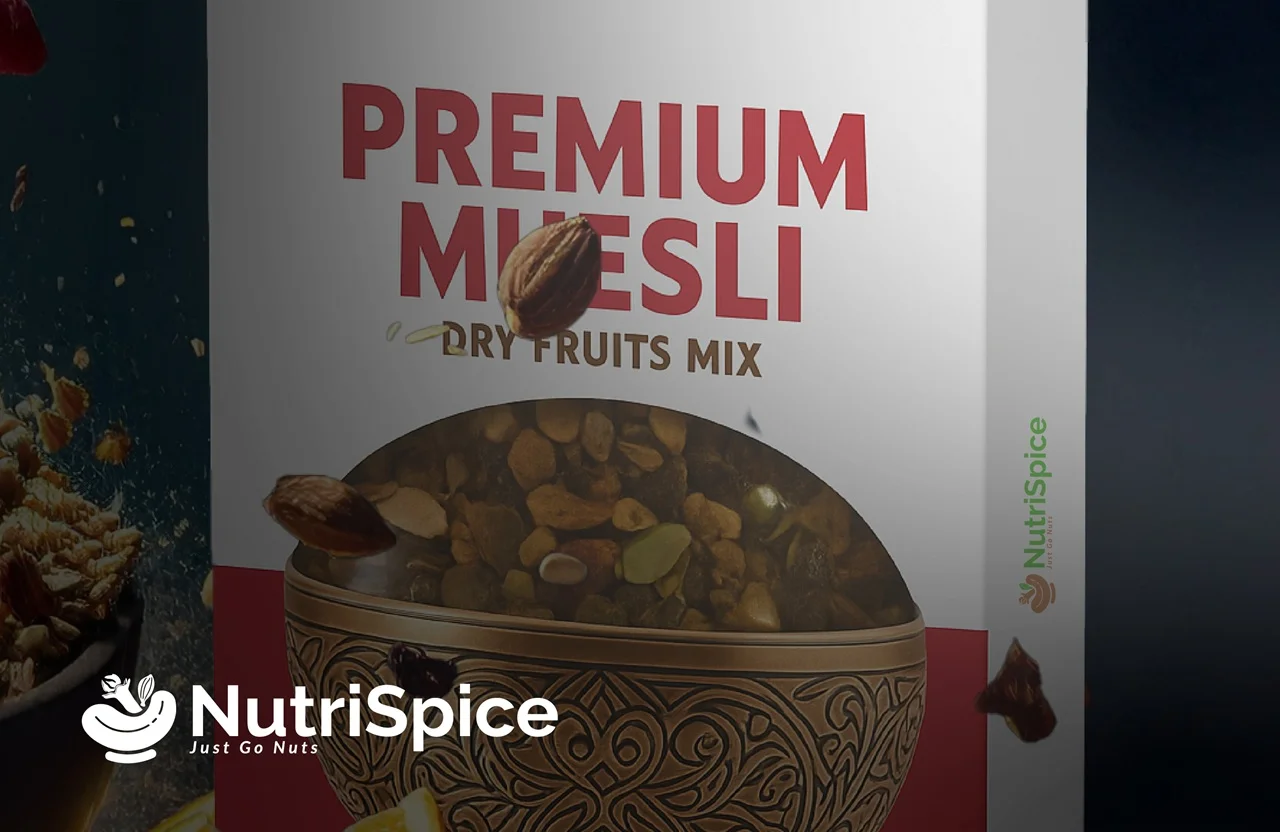
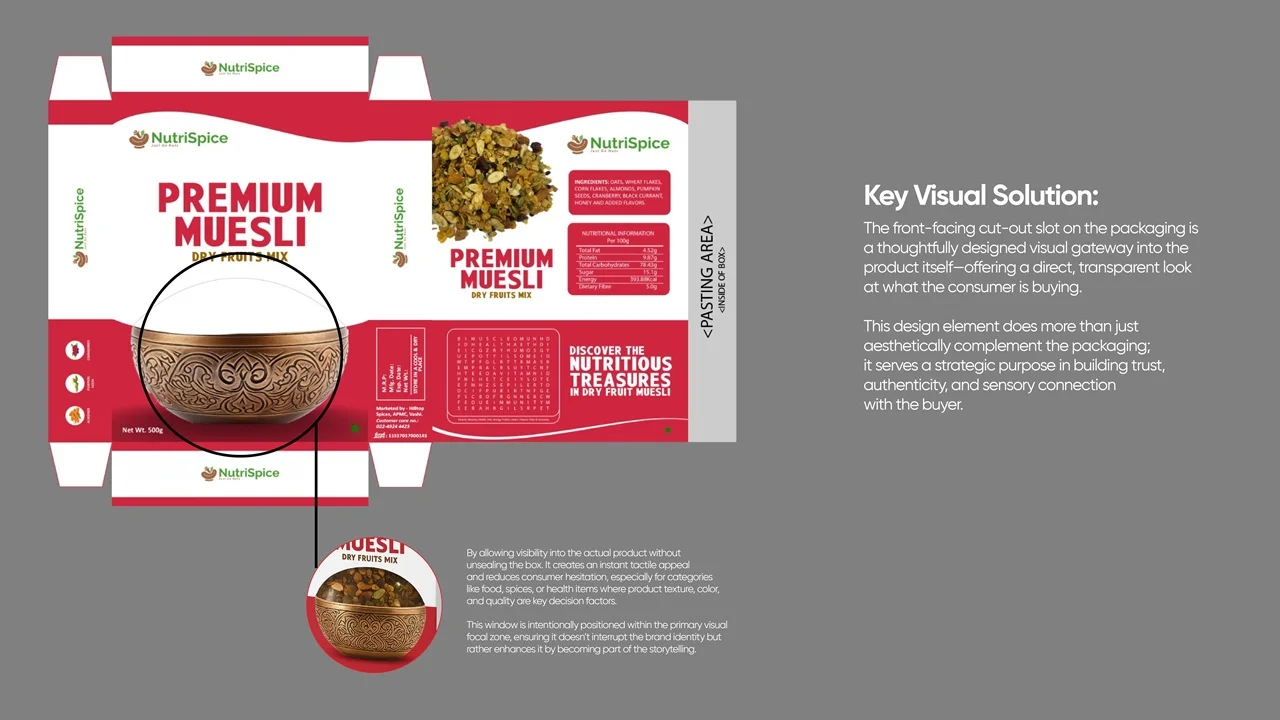
Packaging Design: The packaging for Premium Muesli incorporates a strategically placed front-facing cut-out slot, offering customers a direct window into the product. This builds trust and enhances authenticity, giving buyers a clear, honest view of what they’re purchasing. The cut-out is visually tied to a bowl with intricate patterns, bridging the product window and primary ingredient story. The overall packaging layout features modern, uncluttered graphics, high-impact product names, and easy-to-read nutritional information. The sensory connection is heightened through vibrant photography and real product visibility, inviting shoppers to engage with both the look and quality of the muesli blend.
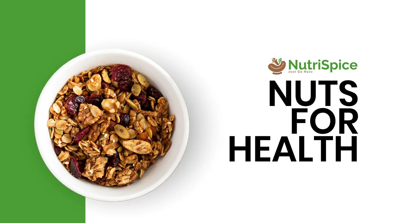
Hero Imagery & Shelf Impact: Marketing visuals spotlight the product in dynamic compositions—bursts of muesli, colorful fruits, and nuts radiating energy and freshness. This sensorial, immersive style captures the essence of NutriSpice as a brand that celebrates flavor, wellness, and joy.